25 April 2017
By Bryan T. Smyth
bryan@TheCork.ie
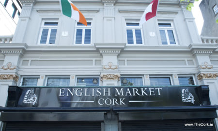
The English Market, Ireland’s oldest indoor food market, officially revealed its new look today. The world renowned market has stepped into the 21st century by giving its main entrance, the Grand Parade facade, a new and improved look in keeping with the Market’s new logo and branding.
With the opening of the much anticipated Capitol development on the way this summer and the rejuvenation of The Grand Parade streetscape The English Market, as one of Corks biggest food attractions, took the step to follow suit and step up their game.
Pat O’Connell, head of the traders committee welcomed the improvements: “We are welcoming the public into the market every day and it’s important that we give the right impression and look the part. The produce we have in the market is top notch so it’s important that other elements of the market are just as good. We have been gradually improving the market over the years but this is the first big visual change we’ve made and I think it makes a huge difference. The whole street looks fantastic with the new Capitol development and we wanted to help enhance the appearance of the street which I really think we have. We’re delighted with it.”

The English Market has stepped into the 21st century by giving it’s Grand Parade facade a new and improved look. Photo: Gerard McCarthy
The new and improved look includes changes to signage which has been updated and consolidated, with flagpoles restored to the front of the building, which now proudly display the Irish tricolour and Cork flag, in keeping with the Market’s emphasis on keeping it local.
Speaking about the renovations, Órla Lannin, Manager of The English Market said: “This element is part of an ongoing refurbishment of the English Market over the last number of years and is also in keeping with exciting new developments on the street. It looks fantastic and the whole street has now been elevated. We are so proud to have the tricolour and the Cork flag flying high and hope all our visitors and customers like the new look.”
With the addition of the former Hilsers jewellers unit to the front of the Market, an emphasis was placed on a new colour scheme and signage for this important façade. The colours were chosen to reflect recent changes to The English Market’s logo and branding and follows recent refurbishments within the Market itself.


